Merge Gardens is a journey of perpetual discovery fused with blissful organisation, challenging puzzles, and that beautifully therapeutic feeling of ticking off tasks on a to-do list.
Campaign
Futureplay made significant changes to the Merge Gardens storyline to enhance the player experience in its upcoming relaunch. The new version of the game features a fresh cast of characters who inhabit the game world. In order to bring these characters to life and create promotional materials for the game, Futureplay partnered with Milford, to design the characters and produce assets for both in-game and marketing use.
The new storyline of Merge Gardens is centered around restoring a mansion that has been forgotten for ages. As players progress through the game, they will restore the garde, uncover secrets and solve puzzles. It was essential for Futureplay to introduce this new storyline in an epic way to attract players, as the competition in the Merge games market is fierce. Most of the marketing content in this genre is looking the same. To achieve a unique look and feel for their promotional campaign we decided to move away from the standard aesthetic that their competitors were using. Instead, we aimed for a teaser-like style that would resemble that of a high-end animated feature.
Campaign
Futureplay made significant changes to the Merge Gardens storyline to enhance the player experience in its upcoming relaunch. The new version of the game features a fresh cast of characters who inhabit the game world. In order to bring these characters to life and create promotional materials for the game, Futureplay partnered with Milford, to design the characters and produce assets for both in-game and marketing use.
Garden of Mystery
Client
Agency
Production Co.
Director
Futureplay
Bond
Milford Animation Studios
Kim Hagen Jensen
The Story
The new storyline of Merge Gardens is centered around restoring a mansion that has been forgotten for ages. As players progress through the game, they will restore the garde, uncover secrets and solve puzzles. It was essential for Futureplay to introduce this new storyline in an epic way to attract players, as the competition in the Merge games market is fierce. Most of the marketing content in this genre is looking the same. To achieve a unique look and feel for their promotional campaign we decided to move away from the standard aesthetic that their competitors were using. Instead, we aimed for a teaser-like style that would resemble that of a high-end animated feature.
Garden of Mystery
Client
Production Co.
Agency
Director
Futureplay
Milford
Bond
Kim Hagen Jensen
Assignment
Futurplay’s new storyline captivated us with it’s world of gardening and mysterious characters. In recognizing the importance of the game’s narrative, we realized that a cinematic approach in the creation of marketing content would be the most effective way to convey the story to players. This approach would make game trailers and key art more engaging and provide a more immersive experience for the players.To fulfill a cinematic approach, we brought on board our new director Kim Hagen-Jensen. A feature film director with a wealth of experience in both direction and art direction, a perfect match for the storytelling we were looking for.
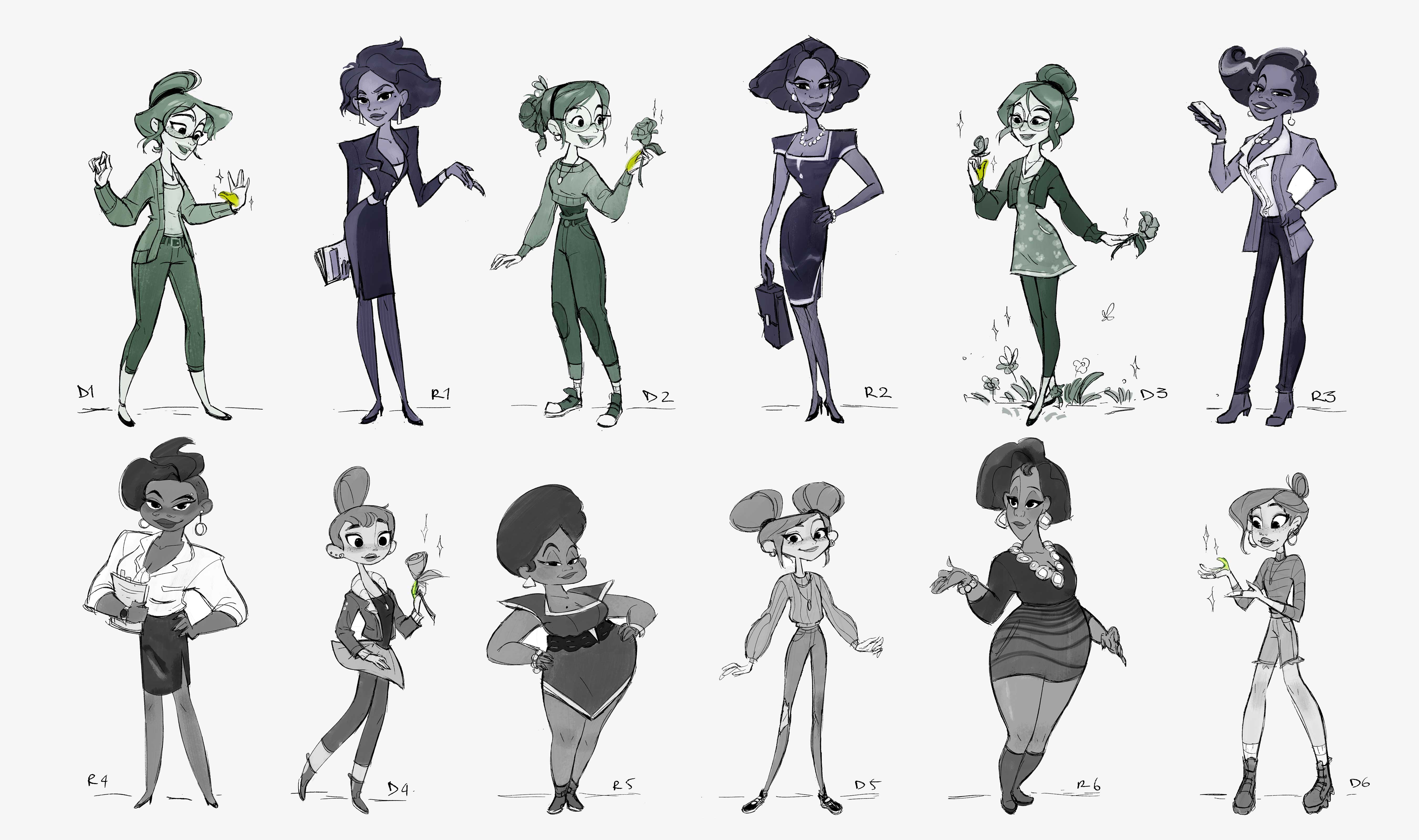
As part of our assignment, we developed 12 characters that represented different decades. Creating a character line up that was both coherent and diverse was important for several reasons. Firstly, the characters needed to fit into the game’s storyline and be created for an overall aesthetic that suited both in-game and marketing purposes. Secondly, each character needed to be unique and memorable, so players could easily distinguish them from one another. Finally, we wanted to create characters that players would be emotionally invested in, and who add depth and richness to the game’s narrative. By carefully designing each character, we were able to achieve these goals and create a cohesive and compelling cast of characters for the game.
Assignment
Futurplay’s new storyline captivated us with it’s world of gardening and mysterious characters. In recognizing the importance of the game’s narrative, we realized that a cinematic approach in the creation of marketing content would be the most effective way to convey the story to players. This approach would make game trailers and key art more engaging and provide a more immersive experience for the players.To fulfill a cinematic approach, we brought on board our new director Kim Hagen-Jensen. A feature film director with a wealth of experience in both direction and art direction, a perfect match for the storytelling we were looking for.
As part of our assignment, we developed 12 characters that represented different decades.
Creating a character line up that was both coherent and diverse was important for several reasons. Firstly, the characters needed to fit into the game’s storyline and be created for an overall aesthetic that suited both in-game and marketing purposes. Secondly, each character needed to be unique and memorable, so players could easily distinguish them from one another. Finally, we wanted to create characters that players would be emotionally invested in, and who add depth and richness to the game’s narrative. By carefully designing each character, we were able to achieve these goals and create a cohesive and compelling cast of characters for the game.
Assignment
Ever since Futurplay presented the new storyline, we were in love with the idea of a world of gardening and mysterious characters telling intriguing stories.
In recognizing the importance of the game’s narrative, we realized that a cinematic approach in the creation of marketing content would be the most effective way to convey the story to players. This approach would make game trailers and key art more engaging and provide a more immersive experience for the players.
As part of our assignment, we developed 12 characters that represented different decades.
Creating a character line up that was both coherent and diverse was important for several reasons. Firstly, the characters needed to fit into the game’s storyline and be created for an overall aesthetic that suited both in-game and marketing purposes. Secondly, each character needed to be unique and memorable, so players could easily distinguish them from one another. Finally, we wanted to create characters that players would be emotionally invested in, and who add depth and richness to the game’s narrative. By carefully designing each character, we were able to achieve these goals and create a cohesive and compelling cast of characters for the game.
The Story
Futureplay and their agency Bond have done a fantastic job in developing an interesting storyline for Merge Gardens relaunch. A Story that will attract the interest of players and stand out in the competitive Merge games segment. The story is centered around Daisy, a city girl who inherits a countryside mansion from a family member she never knew existed. Along the way, she meets a lawyer named Rita, who initially tries to transfer ownership and close the case quickly but eventually becomes an integral part of the story.
In early discussions about the project, we recognized that the narrative would be most effectively conveyed through a cinematic approach. One of the initial considerations was determining the extent to which we could experiment with different visual styles, as the marketing material would not necessarily need to mirror the aesthetics of the actual game.
It became important for us to assign a director and art director who could adapt to different styles. To fulfill this requirement, we brought onboard our new director Kim Hagen-Jensen. A feature film director with a wealth of experience in both direction and art direction, making him the perfect fit for the job.
The Story
The new storyline of Merge Gardens is centered around restoring a mansion that has been forgotten for ages. As players progress through the game, they will restore the garden, uncover secrets and solve puzzles. It was essential for Futureplay to introduce this new storyline in an epic way to attract players, as the competition in the Merge games market is fierce. Most of the marketing content in this genre is looking the same. To achieve a unique look and feel for their promotional campaign we decided to move away from the standard aesthetic that their competitors were using. Instead, we aimed for a teaser-like style that would resemble that of a high-end animated feature.
Garden of Mystery
Client
Agency
Production Co
Director
Future Play
Bond
Milford Animation Studios
Kim Hagen Jensen
Daisy and Rita embark on a journey to restore the neglected estate to its former glory. As they work to solve the puzzles and unravel the secrets hidden within the mansion for decades, they will uncover the truth about Daisy's past and the mysterious human-shaped bushes in the garden.
Our Assignment
In recognizing the importance of the game’s narrative, we realized that a cinematic approach in the creation of marketing content would be the most effective way to convey the story to players. This approach would make game trailers and key art more engaging and provide a more immersive experience for the players. To fulfill a cinematic approach, we brought on board our new director Kim Hagen-Jensen. A feature film director with a wealth of experience in both direction and art direction, a perfect match for the storytelling we were looking for.
The Garden
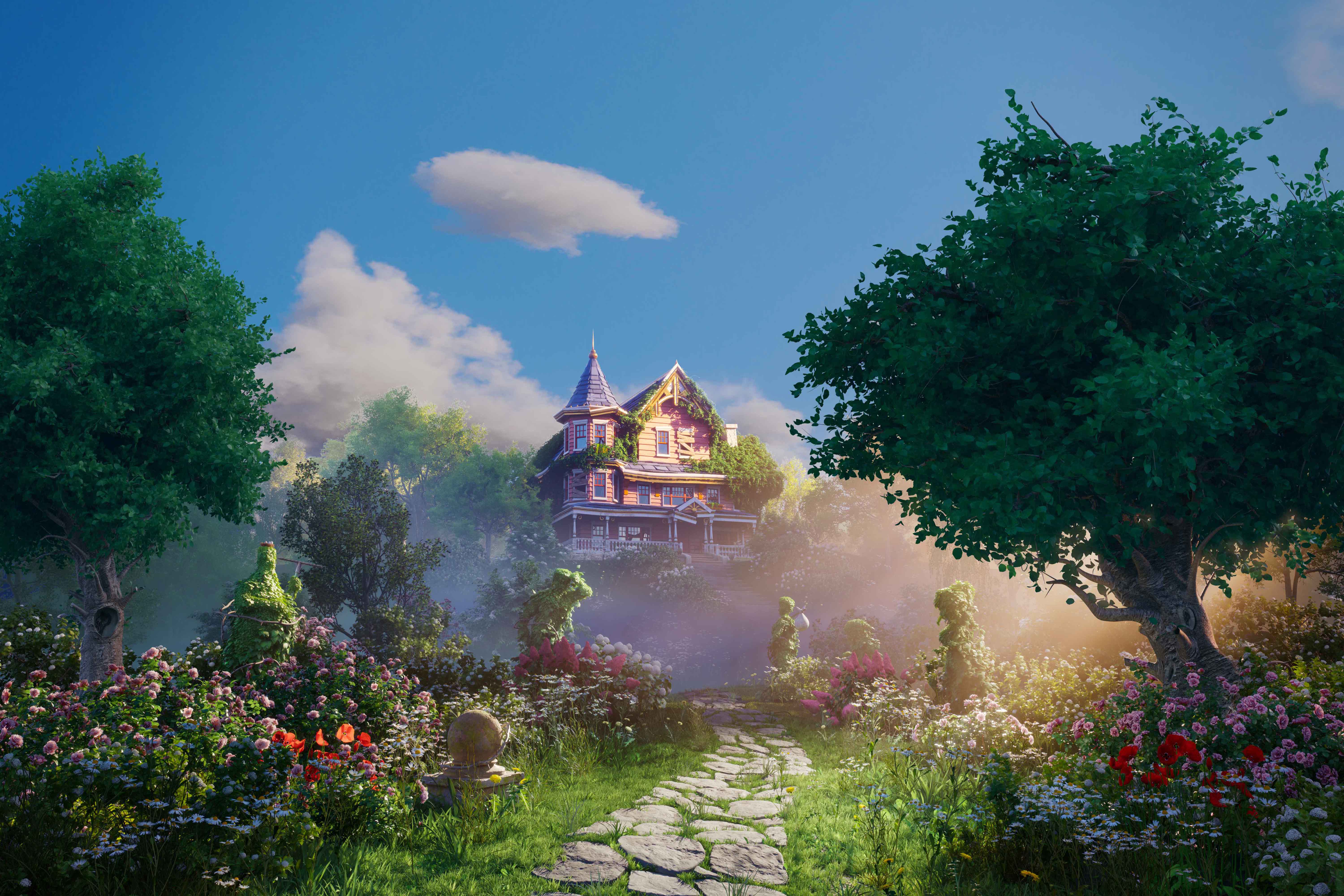
I envisioned the garden as overgrown, abandoned, and imbued with a sense of magical mystery. For inspiration, I researched visuals of old English gardens and abandoned overgrown mansions.
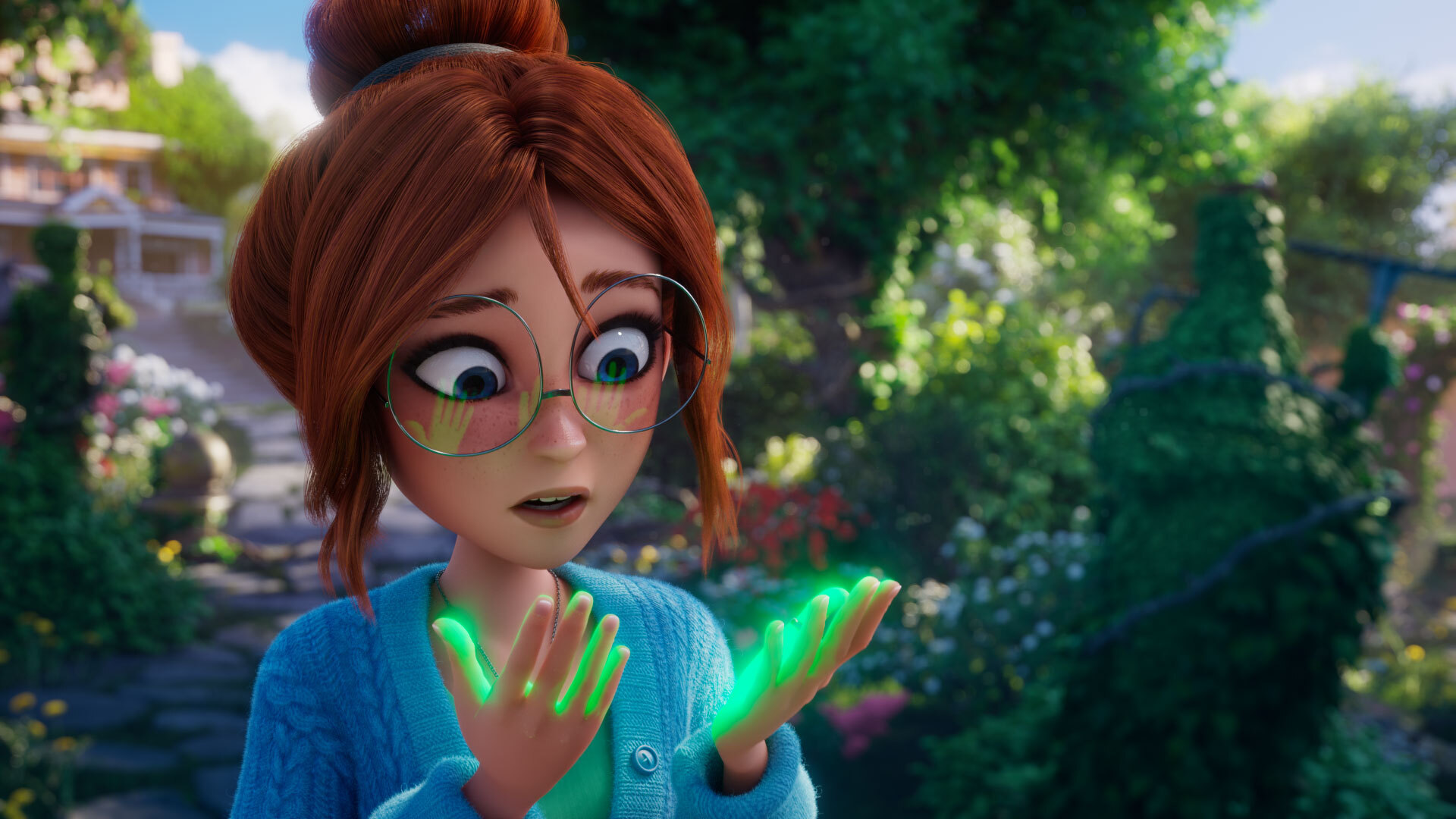
The garden was intended to evoke a feeling of mystery and magic, but not in a dark or scary way. I imagined the morning sun shining at a medium-low angle, illuminating parts of the mansion and garden while also casting shadow areas that would enhance the presence of a mysterious morning fog. This was crucial in creating a dark backdrop for Daisy's glowing hands towards the end of the film, a tricky feat to achieve in sunlight.
In addition to that, I pictured atmospheric elements, such as particles in the air, insects, and flickering lights from the movement of leaves, to further convey a sense of mystery and magic.
Through several design drawings and reference notes on vegetation design and cinematic considerations, the animation team at Milford developed a set design and lighting approach that effectively captured the vision I was aiming for.
This garden was ready to be explored
Character Design
When I read the brief for this film I felt that here was an opportunity to develop a style that would look and feel like a teaser for a high-end animated feature film with great acting, interesting characters, and an immersive setting. My vision was to reveal the world of a magical garden through Daisy and her lawyer Rita in a way that would draw audiences in and make them want to explore the secrets of the old mansion and its mystical surroundings. Secrets that would ultimately transform Daisy's life in later installments.
To reach a broad audience, I felt it was important to create characters that were both interesting and unique, while also maintaining a classic appeal reminiscent of early Disney.
In the design language, I sought to create contrasts between the two characters
Daisy!
an independent and classic city-girl in her early thirties. Daisy was embodied as a rounded, soft-edged character with bright pastel colors who sought to achieve the highest possible price for the old mansion.Daisy!
an independent and classic city-girl in her early thirties. Daisy was embodied as a rounded, soft-edged character with bright pastel colors who sought to achieve the highest possible price for the old mansion.
Rita!
an independent and classic city-girl in her early thirties. Daisy was embodied as a rounded, soft-edged character with bright pastel colors who sought to achieve the highest possible price for the old mansion.an independent and classic city-girl in her early thirties. Daisy was embodied as a rounded, soft-edged character with bright pastel colors who sought to achieve the highest possible price for the old mansion.
The Garden
We envisioned the garden as overgrown, abandoned, and imbued with a sense of magical mystery.
The garden was intended to evoke a feeling of mystery and magic, but not in a dark or scary way. I imagined the morning sun shining at a medium-low angle, illuminating parts of the mansion and garden while also casting shadow areas that would enhance the presence of a mysterious morning fog. This was crucial in creating a dark backdrop for Daisy's glowing hands towards the end of the film, a tricky feat to achieve in sunlight.
In addition to that, I pictured atmospheric elements, such as particles in the air, insects, and flickering lights from the movement of leaves, to further convey a sense of mystery and magic.
Through several design drawings and reference notes on vegetation design and cinematic considerations, the animation team at Milford developed a set design and lighting approach that effectively captured the vision I was aiming for.
This garden was ready to be explored. :)
Character Design
Creating characters with distinct personalities is an elaborate process of finding the right traits that, in this case, emphasize appeal and likability. In the design language, we blended edgy, cool graphic shapes and variations with traditional cartoon design elements maintaining a classic appeal reminiscent of early Disney, to add depth and dynamics to the overall aesthetic.
"When reading the brief I immediately felt that this was an opportunity
to develop a style that would look and feel like a teaser for a high-end animated feature film
with great acting, interesting characters, and an immersive setting."
- Kim Hagen-Jensen, Director -
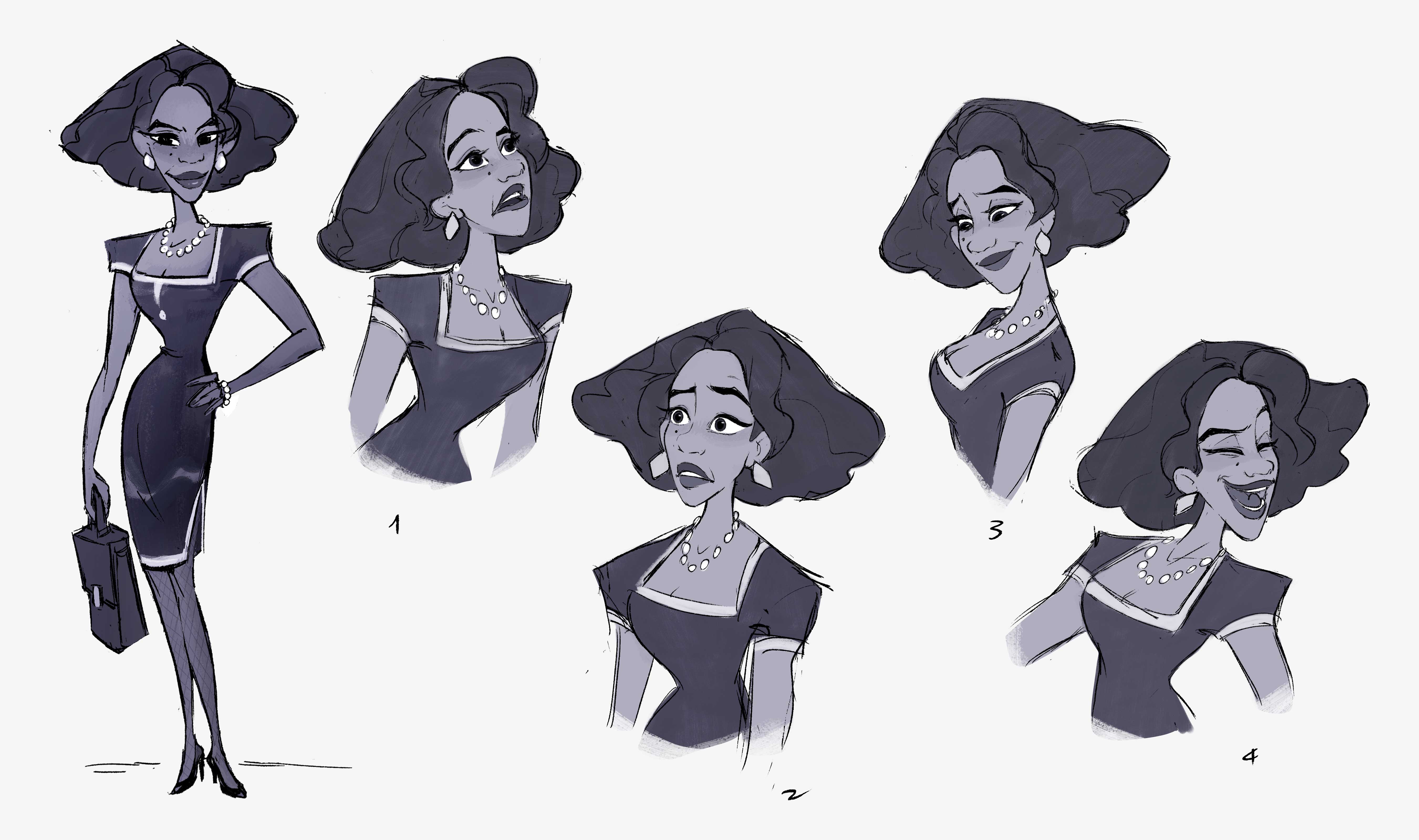
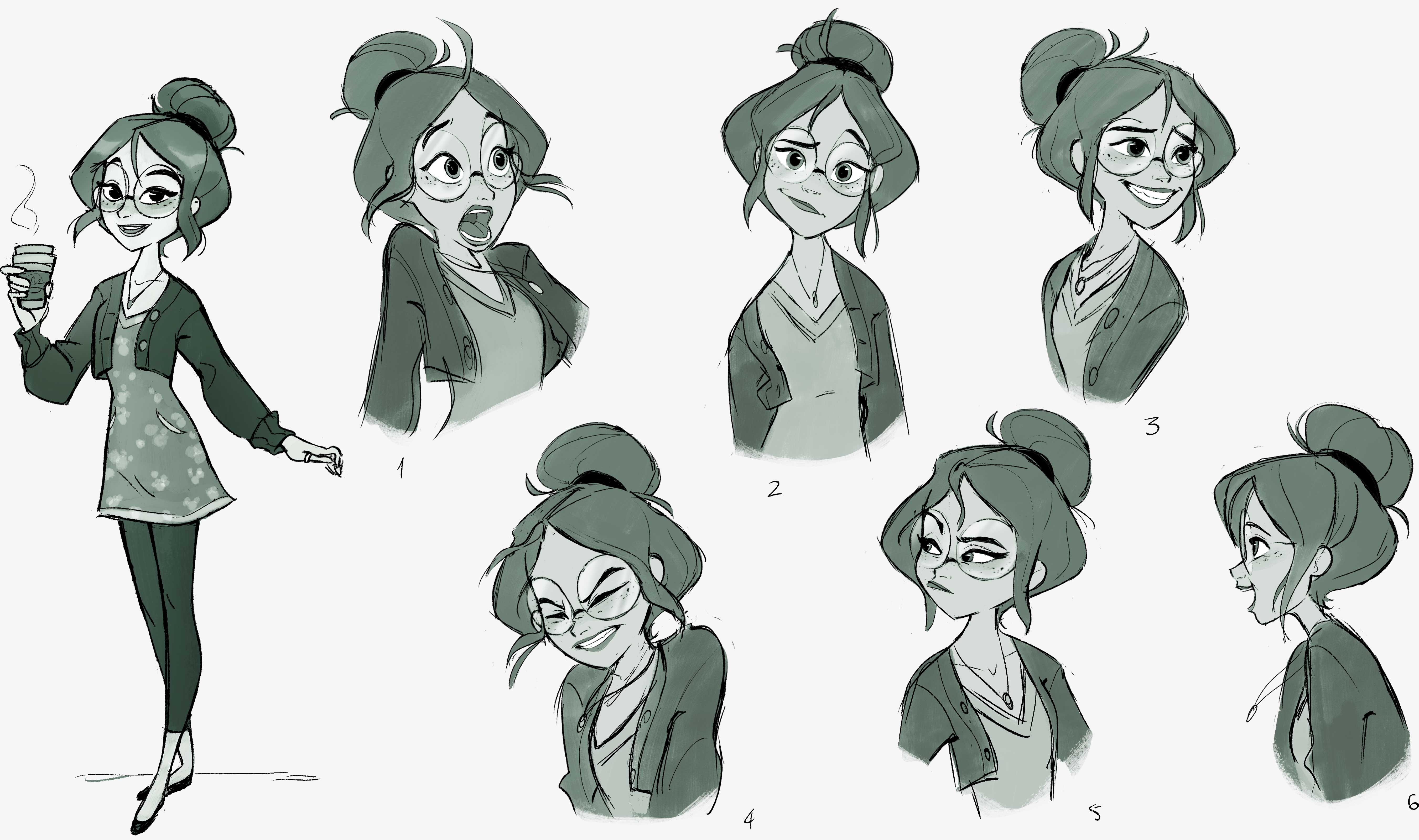
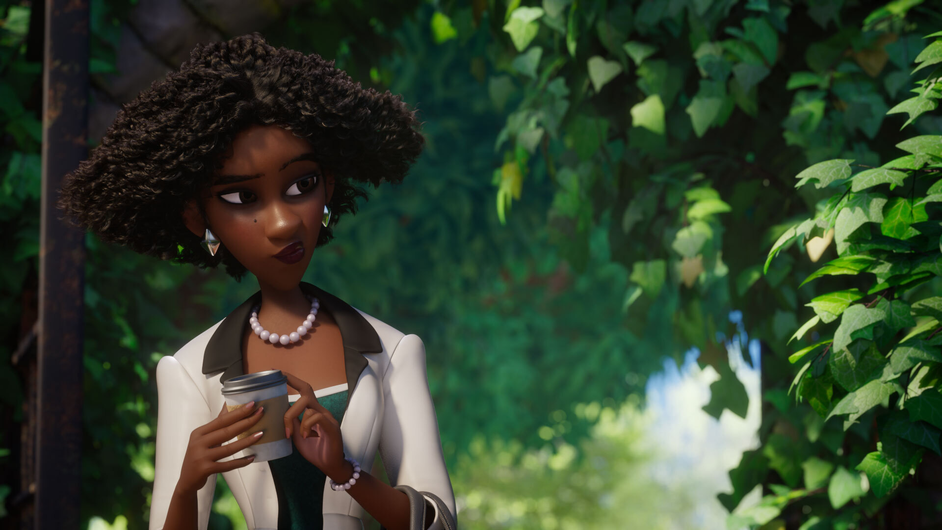
For the two characters in the introduction trailer we sought to create contrasts between the characters. Daisy was embodied as a rounded, soft-edged character with bright pastel colors, while Rita was sharp-angled with darker tones. The clothing styles matched their personalities, with Daisy being a classic and independent young city girl often seen at the local café with her favorite coffee, and Rita as a refined and sophisticated upper-class society lawyer with a penchant for gossip.

Animation & Acting performance
In the introduction trailer it was important to express the contrast between Daisy and Rita through their body language, as this would help to communicate their personalities and distinguish them from each other.
Daisy’s character was designed to be somewhat uncertain and timid, while Rita was meant to come across as slightly intimidating, flamboyant, and with a salesperson-like demeanor. To achieve this contrast, we carefully considered their poses, movements, and facial expressions, and made sure that each character’s body language aligned with their respective personalities.
Character Design
Creating characters with distinct personalities is an elaborate process of finding the right traits that, in this case, emphasize appeal and likability. In the design language, we blended edgy, cool graphic shapes and variations with traditional cartoon design elements maintaining a classic appeal reminiscent of early Disney, to add depth and dynamics to the overall aesthetic.
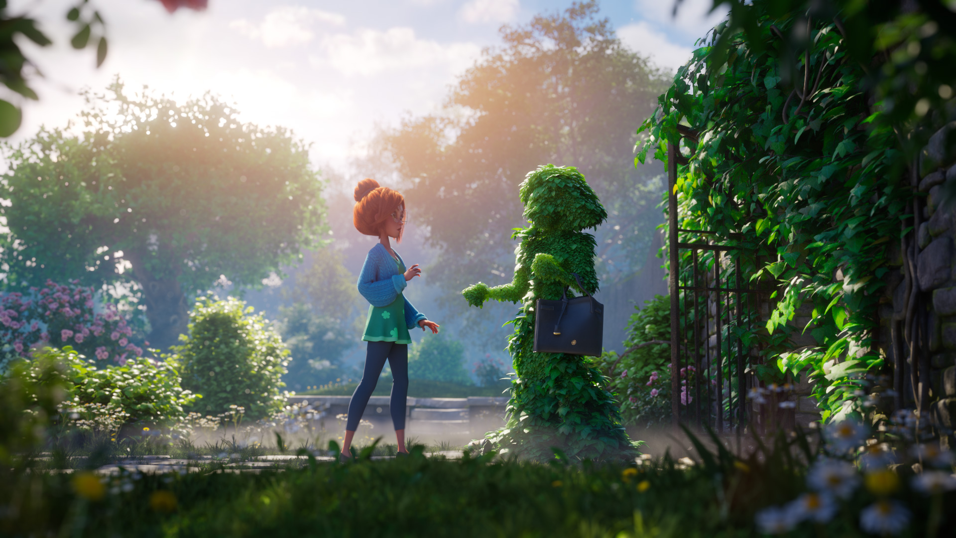
Our main character, Daisy, is an independent young woman in her early thirties. A self-proclaimed city-girl who loves all the amenities a big city offers her. Living a simple life in her studio flat with only the most basic stuff to survive. She considers herself as a minimalist although she is probably closer to a perfectionist. Daisy was embodied as a rounded, soft-edged character with bright pastel colors.


Animation & Acting
In the introduction trailer it was important to express the contrast between Daisy and Rita through their body language, as this would help to communicate their personalities and distinguish them from each other.Daisy’s character was designed to be somewhat uncertain and timid, while Rita was meant to come across as slightly intimidating, flamboyant, and with a salesperson-like demeanor. To achieve this contrast, we carefully considered their poses, movements, and facial expressions, and made sure that each character’s body language aligned with their respective personalities.
As the story progressed, we introduced an overgrown and scruffy garden, which became a focal point for the characters. This also marked a reversal in the story, where Daisy’s attitude shifted and she became determined to sell the property, whereas Rita was left feeling a little hesitant.
When Rita was transformed back from her topiary state, we had a lot of fun creating confusion in her character, which added to the overall entertainment value of the story. This also created an interesting contrast to Daisy’s and Rita’s usual personas, as they now were completely puzzled by Daisy’s newfound powers. Overall, the body language and actions of each character were carefully crafted to create an engaging and dynamic story when introducing the new world of Merge Gardens.
Character Design
Creating characters with distinct personalities is an elaborate process of finding the right traits that, in this case, emphasize appeal and likability. In the design language, we blended edgy, cool graphic shapes and variations with traditional cartoon design elements maintaining a classic appeal reminiscent of early Disney, to add depth and dynamics to the overall aesthetic.

"When reading the brief I immediately felt that this was an opportunity
to develop a style that would look and feel like a teaser for a high-end animated feature film
with great acting, interesting characters, and an immersive setting."
- Kim Hagen-Jensen, Director -
Creating characters with distinct personalities is an elaborate process of finding the right traits that, in this case, emphasize appeal and likability. In the design language, we blended edgy, cool graphic shapes and variations with traditional cartoon design elements maintaining a classic appeal reminiscent of early Disney, to add depth and dynamics to the overall aesthetic.


Animation & Acting
In the introduction trailer it was important to express the contrast between Daisy and Rita through their body language, as this would help to communicate their personalities and distinguish them from each other.Daisy’s character was designed to be somewhat uncertain and timid, while Rita was meant to come across as slightly intimidating, flamboyant, and with a salesperson-like demeanor. To achieve this contrast, we carefully considered their poses, movements, and facial expressions, and made sure that each character’s body language aligned with their respective personalities.
As the story progressed, we introduced an overgrown and scruffy garden, which became a focal point for the characters. This also marked a reversal in the story, where Daisy’s attitude shifted and she became determined to sell the property, whereas Rita was left feeling a little hesitant.
When Rita was transformed back from her topiary state, we had a lot of fun creating confusion in her character, which added to the overall entertainment value of the story. This also created an interesting contrast to Daisy’s and Rita’s usual personas, as they now were completely puzzled by Daisy’s newfound powers. Overall, the body language and actions of each character were carefully crafted to create an engaging and dynamic story when introducing the new world of Merge Gardens.
In-Game Assets
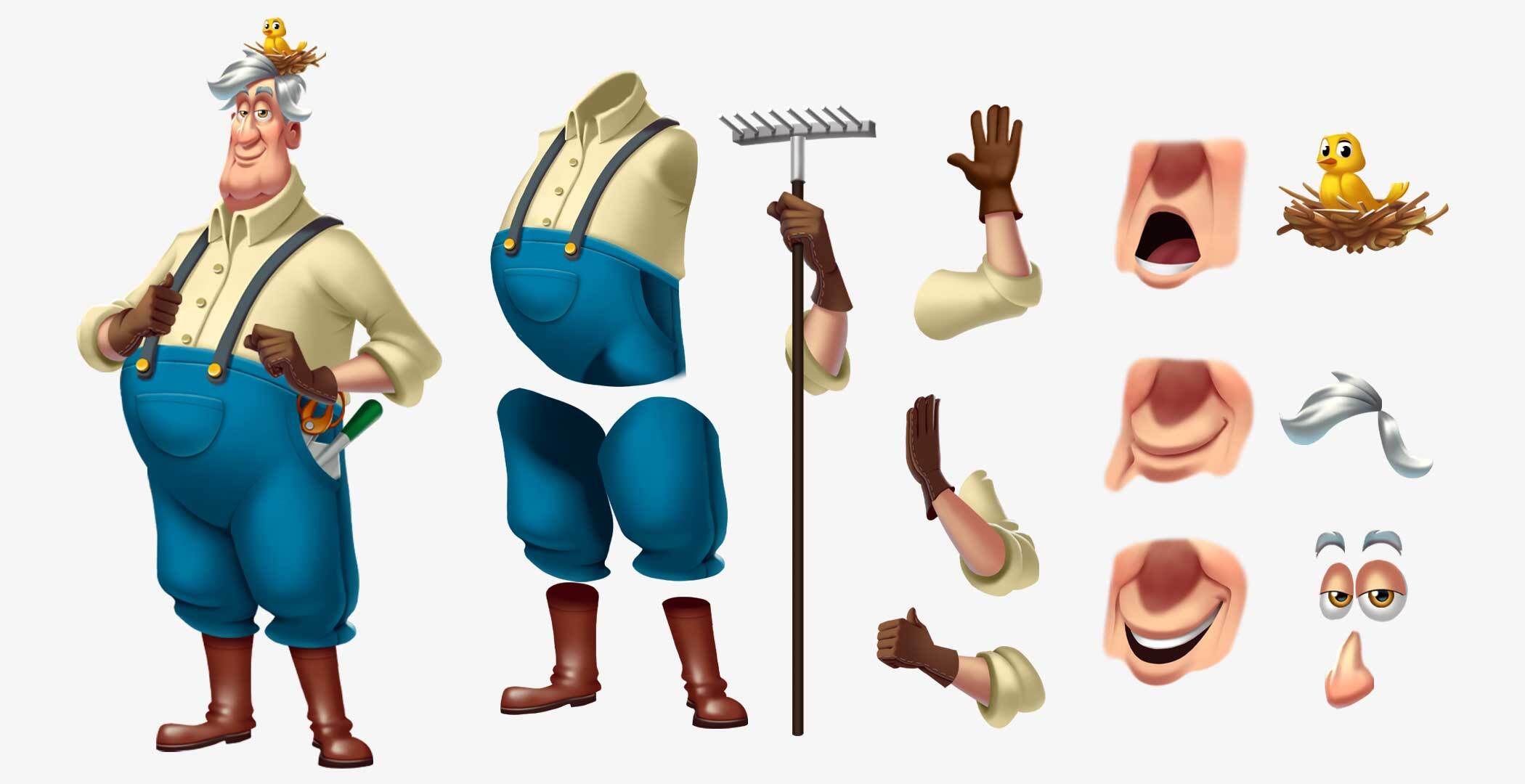
Thrilled with our work done in the visual exploration phase, when designing the character line up, Futureplay wanted to take our collaboration to the next level by translating our character designs into 2d in-game assets and exploring a visual style that would elevate the gaming experience. To achieve this, we broke down each character into individual pieces, allowing for various expressions and animations. Futureplay then took the assets breakdowns we created in Photoshop and imported them into Spine for animation.
As the story progressed, we introduced an overgrown and scruffy garden, which became a focal point for the characters. This also marked a reversal in the story, where Daisy’s attitude shifted and she became determined to sell the property, whereas Rita was left feeling a little hesitant.
When Rita was transformed back from her topiary state, we had a lot of fun creating confusion in her character, which added to the overall entertainment value of the story. This also created an interesting contrast to Daisy’s and Rita’s usual personas, as they now were completely puzzled by Daisy’s newfound powers. Overall, the body language and actions of each character were carefully crafted to create an engaging and dynamic story when introducing the new world of Merge Gardens.
In-Game Assets
Thrilled with our work done in the visual exploration phase, when designing the character line up, Futureplay wanted to build on this success by translating our character designs into 2d in-game assets and exploring a visual style that would elevate the gaming experience. To achieve this, we broke down each character into individual pieces, allowing for various expressions and animations. Futureplay then took the assets breakdowns we created in Photoshop and imported them into Spine for animation.
In-Game Assets
Thrilled with our work done in the visual exploration phase, when designing the character line up, Futureplay wanted to take ourcollaboration to the next level by translating our character designs into 2d in-game assets and exploring a visual style that would elevate the gaming experience. To achieve this, we broke down each character into individual pieces, allowing for various expressions and animations. Futureplay then took the assets breakdowns we created in Photoshop and imported them into Spine for animation.

We hope this first delivery of marketing content for Merge Garden will attract players to emotionally invest in the new storyline with all its new characters, uncovering secrets and solving puzzles. There is more to come!
Episode 3
Garden of Mystery
Daisy and Rita embark on a journey to restore the neglected estate to its former glory. As they work to solve the puzzles and unravel the secrets hidden within the mansion for decades, they will uncover the truth about Daisy's past and the mysterious human-shaped bushes in the garden.
Project Page
Episode 5
The Tragedy
While Daisy is fighting the evergrowth monster, her green thumb power allows her to uncover another secret, hidden in this garden, that has shaped the destiny of Myrtlegrove and its inhabitant.
Project Page

Character Design
To stand out from the fierce competition of similar games we wanted to develop a style that would look and feel like a teaser for a high-end animated feature film with great acting, interesting characters, and an immersive setting.
Our goal was to create characters that were both interesting and unique, while also maintaining a classic appeal reminiscent of early Disney. To achieve this, we blended edgy, cool graphic shapes and variations with traditional cartoon design elements to add depth and dynamics to the overall aesthetic. Additionally, we made a conscious effort to incorporate contrast between the two characters Daisy and Rita by using different design techniques such as round and square shapes.
Daisy
Our main character, Daisy, is an independent young woman in her early thirties. A self-proclaimed city-girl who loves all the amenities a big city offers her. Living a simple life in her studio flat with only the most basic stuff to survive. She considers herself as a minimalist although she is probably closer to a perfectionist. Daisy was embodied as a rounded, soft-edged character with bright pastel colors.


Rita
Rita is a refined and sophisticated upper-class society lawyer in her early forties. A social butterfly and a modern business woman who is fashionable and stylish. She loves to gossip and keep track of what’s going on. Rita was designed sharp-angled with darker tones.
Daisy
Our main character, Daisy, is an independent young woman in her early thirties. A self-proclaimed city-girl who loves all the amenities a big city offers her. Living a simple life in her studio flat with only the most basic stuff to survive. She considers herself as a minimalist although she is probably closer to a perfectionist. Daisy was embodied as a rounded, soft-edged character with bright pastel colors.

Rita
Rita is a refined and sophisticated upper-class society lawyer in her early forties. A social butterfly and a modern business woman who is fashionable and stylish. She loves to gossip and keep track of what’s going on. Rita was designed sharp-angled with darker tones.
